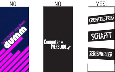
As the responsable for creating the graphic typographic art of the wall of prejudice, I decided to come here to tell you a little bit about the working process.
Well, after the concept team decided which were the good sentences for the wall, we had to think how would this area be interesting and keeping the concept of the instalation on this part of the experience!
The decision was taken by the group after a big brainstorming and variations of ideas was to make a wall of long curtains (2m by 0,8m) where people could walk trough it and feel themselves a little bit lost in the words ( but taking care for not making them wanting to run out of there!). We also decided the curtains colors to be black and white, so they could shine on black light.

Drafts for the wall of prejudices. graphics © Lara Garcia
The concept I tought while creating the curtains was to make strong, heavy and “broken-noisy” typographic compositions with the senteces to bring some impact. All of them are different but with the same style line to keep people interested on the prejudices and have that “ what comes next” feeling. After some trys that didn´t got the right solutions I finally could have the support for the group on a 60 options try, and after that we made a final selection that brought us to the 40 final ones. Here goes a sample of the evolution from the curtains! Now I can´t wait to see them printed!
Entry by Lara Garcia
